


Our Identity
We’re proud to share this comprehensive suite of PAGNY resources and guides.
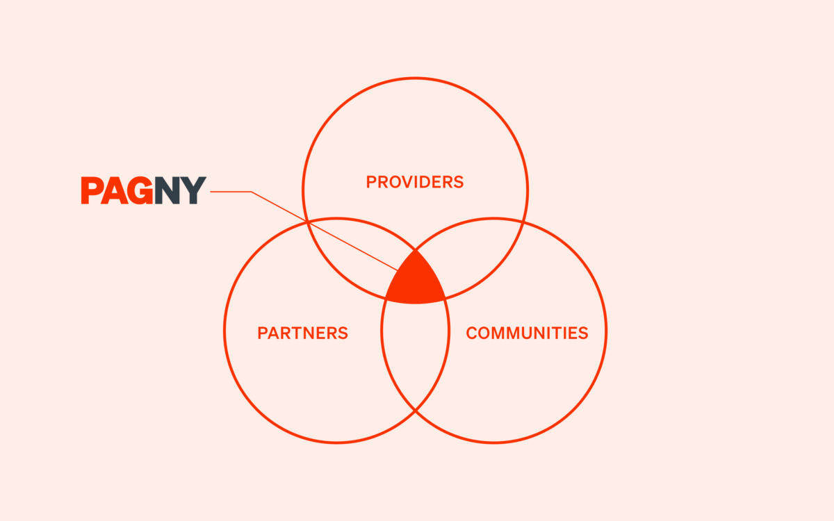
PAGNY Promise
We provide accountable, responsive, quality care with the highest degree of sensitivity to the needs of the multicultural population that lives in our New York community.
PAGNY Guiding Principles
We’ve codified our commitment to our providers, our partners, and the communities that we serve in our nine Guiding Principles. You'll find these Guiding Principles woven into every page on our new website. For the full list, visit Our commitment.
Tools and Templates
We’ve created a brand toolkit—complete with our logos, easy-to-use Microsoft Word and PowerPoint templates, and screen savers—that you can use to create official documents and communications and personalize your desktop.
Click the links to download:
Logo
Our logo has a contemporary font and color palette to reflect our commitment to cutting-edge medicine and technology and compassionate care.
Color palette
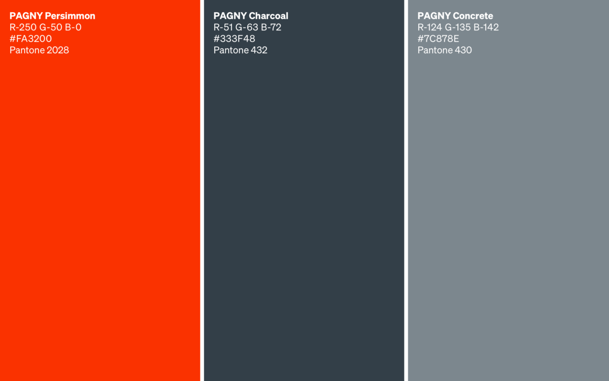
PAGNY Persimmon evokes the warmth and care our providers show to our patients every day, while PAGNY Charcoal and PAGNY Concrete evoke the built architecture of New York City.
Extended palette for the web
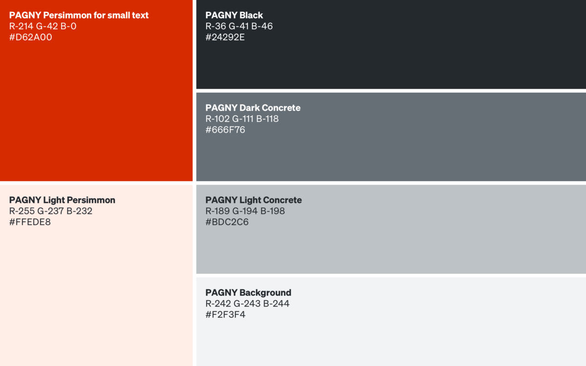
Our extended palette for the web helps us make our web-based content stand out. In addition to a slightly darker shade of PAGNY Persimmon for AA contrast compliant small text, we’ve created PAGNY Black, PAGNY Dark Concrete, PAGNY Light Concrete, PAGNY Background, and PAGNY Light Persimmon.
Type
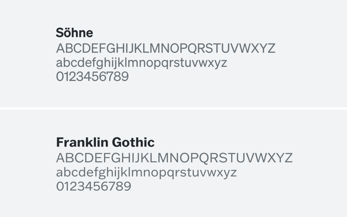
Top: Söhne by Klim Type Foundry. Bottom: Franklin Gothic by American Type Founders Collection.
Our official brand type is Söhne by Klim Type Foundry, while our Microsoft Office brand type is Franklin Gothic Book. These two fonts are contemporary, sans-serif fonts that reflect our commitment to cutting-edge medicine and technology. You'll use fonts from the Franklin Gothic family when creating documents in MS Word, PowerPoint, and Outlook. Recruitment flyers, banners, and other communications will appear in Söhne.
Graphic styles (maps, infographics)
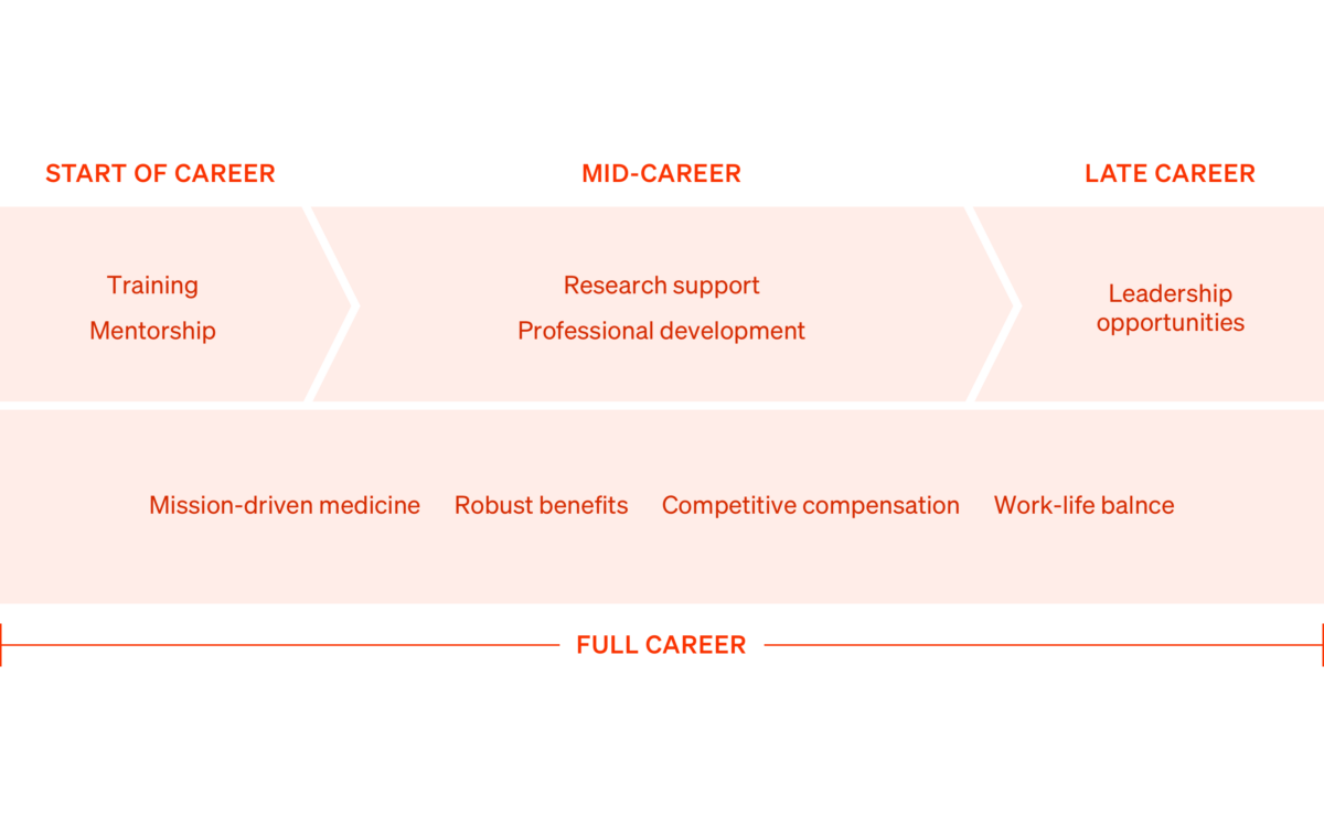
We’ve created infographics that highlight what makes us different from other health care systems.
Signature guidance
We’ve created an email signature that incorporates our lockup and brand colors, PAGNY Persimmon and PAGNY Charcoal. Use Franklin Gothic Book to create your signature.

1. Name, pronouns, and title
Set your full name in 18pt PAGNY Persimmon. Set your pronouns (optional) and title in 11.5pt PAGNY Charcoal.
2. PAGNY lockup
Insert artwork for the PAGNY horizontal lockup (found in the identity assets above) at 2.5 inches wide.
3. Contact information
Set contact information in 11.5pt Charcoal
4. Social links
Set in 11.5pt Charcoal with "PAGNY" in Persimmon for small text. Help us promote our social media with underlined links to our Instagram, Twitter, Facebook, and LinkedIn.
5. Spacing
Insert two blank lines of space between each of the elements above.
Photography

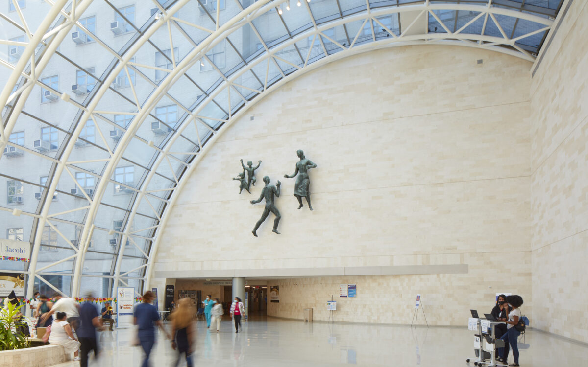
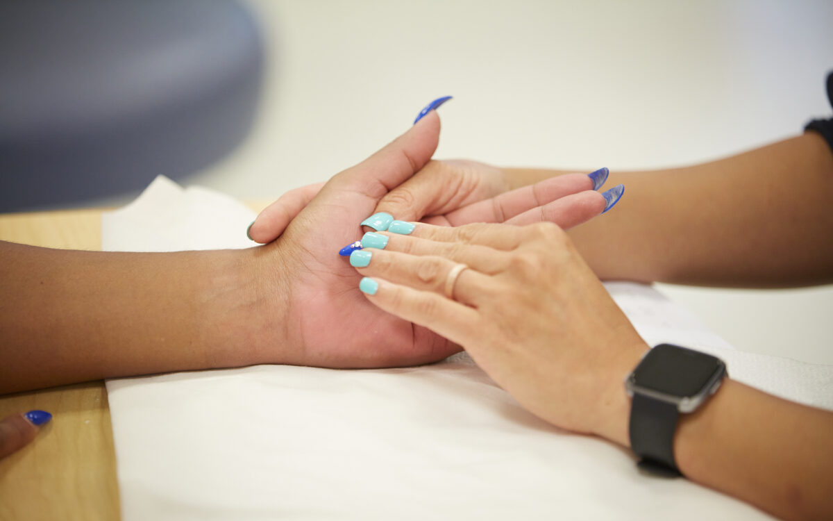


Our commitment to our providers, partners, and patients is nowhere more evident than in our photography direction. We would be nothing without our people, which is why our photography focuses on real moments of compassionate care and collegial camaraderie between patients and providers. You’ll see these and other photographs throughout our website and other communications.